Why do companies change their logos?
 Here are some reasons skipping obvious ones like M&A, change in the name etc:
There are a number of reasons, most often brought about by a combination of external cultural changes and shifts along with internal company shifts that now warrant ensuring that the company is NOT being pigeon-holed into "something from its past."
David Brier, Brand identity specialist, award-winning designerCompanies change their typefaces to keep them up to date, or because an old logo no longer fits with a new business strategy… this could range from a small refinement to a complete redesign.
David Airey, graphic designer, author of Logo Design LoveSometimes companies change their logos for the wrong reasons…Sometimes they change it because there’s a new marketing person in charge…. Sometimes companies make very small changes – almost infinitesimal changes to their logos – which, quite rightly, are derided by the general public… But quite often those little refinements do a good job of making the company seems that little bit more up to date, that little bit more modern. And if you look back over the logo over time, you'll see that those little incremental changes were actually quite important.
Patrick Burgoyne, editor of Creative ReviewCisсo Systems
So, Cisco Systems… one of the largest manufacturers of networking equipment and software, headquartered in Silicon Valley with more than 70K employees all over the world and revenue of U.S. $48 billion in 2017.
Founded 33 years ago the company has grown from on-product vendor into a recognized worldwide leader in networking business.
Here's a rundown of the Cisco logo design evolution, along with some key highlights of the company history.
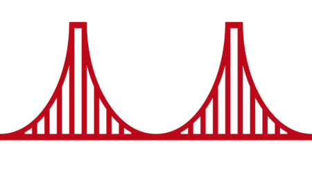
1984 – Golden Gate Bridge | San FranCISCO

Founded in December 1984, Cisco actually started operations in 1987 after the battle with Stanford over charges that the founders used technology that belonged to Stanford to start their business.
"Cisco" was actually derived from the city name San Francisco and initially the company's engineers insisted on using the lower case "cisco". The initial logo depicts the shape of the Golden Gate Bridge, the famous landmark from San Francisco.
1996 – Digital Signal

The growth of the Internet and wide adoption of the IP (Internet Protocol) changed the telecom landscape. Cisco acted promptly to use the new opportunity and quickly became the leading provider of routers and switches.
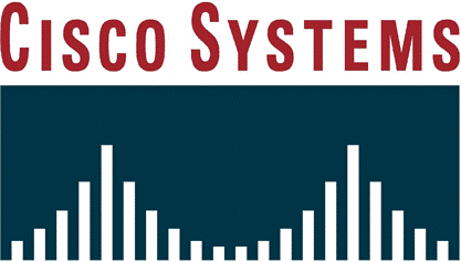
The evolved logo is appended with the company's name "Cisco Systems". It consists of the same bridge but with a different silhouette and enclosed in a box. It now gets a second meaning - a digital signal that reflects the company's business.
2006 – The Human Network

Cisco launched the "Human Network" campaign, which centered on the impact of Internet networks on people and businesses.
This campaign (actually Cisco's largest one) shifted the company's image from a tech vendor to the company that changes the world and the way people communicate. Cisco became the leader in communication and collaboration technologies – VoIP, video conferencing, online collaboration.
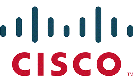
The logo also changed and became much more simple – the bridge consists of only 9 bold strokes, the 'systems' is removed and the remaining "cisco" gets updated to be in the same case and height.
The Cisco logo comes in red and blue. The red color symbolizes responsibility, passion, and readiness to work hard for further success; the blue color represents tranquility, optimism, fame, and prosperity.
2013 – Tomorrow Starts Here

Already the leader, with its CEO John Chambers on the Forbes magazine cover, Cisco started pushing the IoT concept and starts the new "Tomorrow start here" campaign: "Today, more than 99% of our world is still not connected to the Internet. But we're working on it."
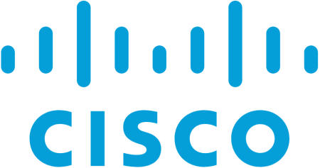
Tolleson and Cisco changed the logo colors to blue.
Yes, this is the brand agency that defines Cisco's visual center – Tolleson. BTW guest where it is located?
